Client
NRG Energy, Inc. has been a long-term client of Kusadama for strategy work. We were asked to redesign one of their portfolio company websites, NRG Curtailment Solutions, Inc. In just 8 weeks, the Kusadama team completely redesigned the Curtailment Solutions website with new copy, new imagery, and new information architecture.
The Website redesign helps attract prospects, reduce exit rates, and encourage lead generation.
The Curtailment Solutions website showcases how a simple, elegant WordPress solution can make a bold impression (and have measurable results!).
Solutions
Information Architecture to Reduce the Paradox of Choice:
- We streamlined up to 11 navigation items into just 6, making it simpler for prospects to quickly decide where to go.
- We removed drop-down navigation on all sites and streamlined sub-pages.
- We made it clear on all pages how to connect with you—with big, bold CTAs.
Bold Design to Attract Attention Immediately:
- Using big, striking images in the “Hero” entices prospects into engaging with each website. This helps reduce exit rates and ensure the audience moves through their prospect stages into the consideration stage.
Increase the Perception of Innovation to Help Convert (and Rebrand):
- Using Parallax design brings a level of interaction where your navigation moves with you, and other content moves in and out of view as you scroll. This makes it more likely that the visitor will read the content of each section and take the next step.
- The design, UX, and development is using a more innovative, new, and modern approach. This can help visitors associate YOU as innovative, new and modern as a result of their innovative browsing experience.
Services
Information Architecture
SEO
Design
Website Development
Project highlights
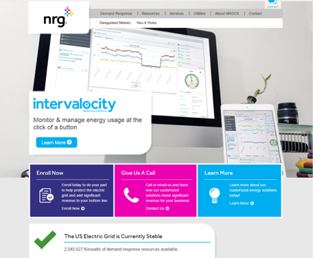
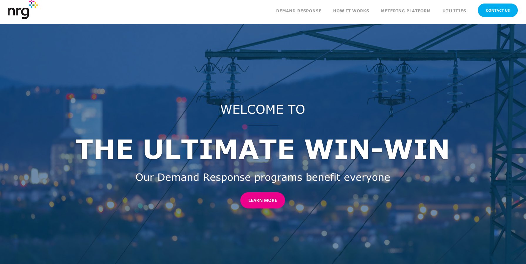
The Before Homepage
Before:
- Two top navigations—can be overwhelming to visitors.
- Main CTA is to the left and not clear (images compete with the CTA).
- Three features in a row competed for attention.

Redesigned Homepage
After:
- Streamlined information architecture: 5 top-navigation items + Home.
- Bold and captivating image and headline designed to attract visitors and keep them on the site.
- One clear CTA above the fold to help increase Click Through Rate and conversions.
- Elegant parallax design which increases the perception of the brand being innovative.
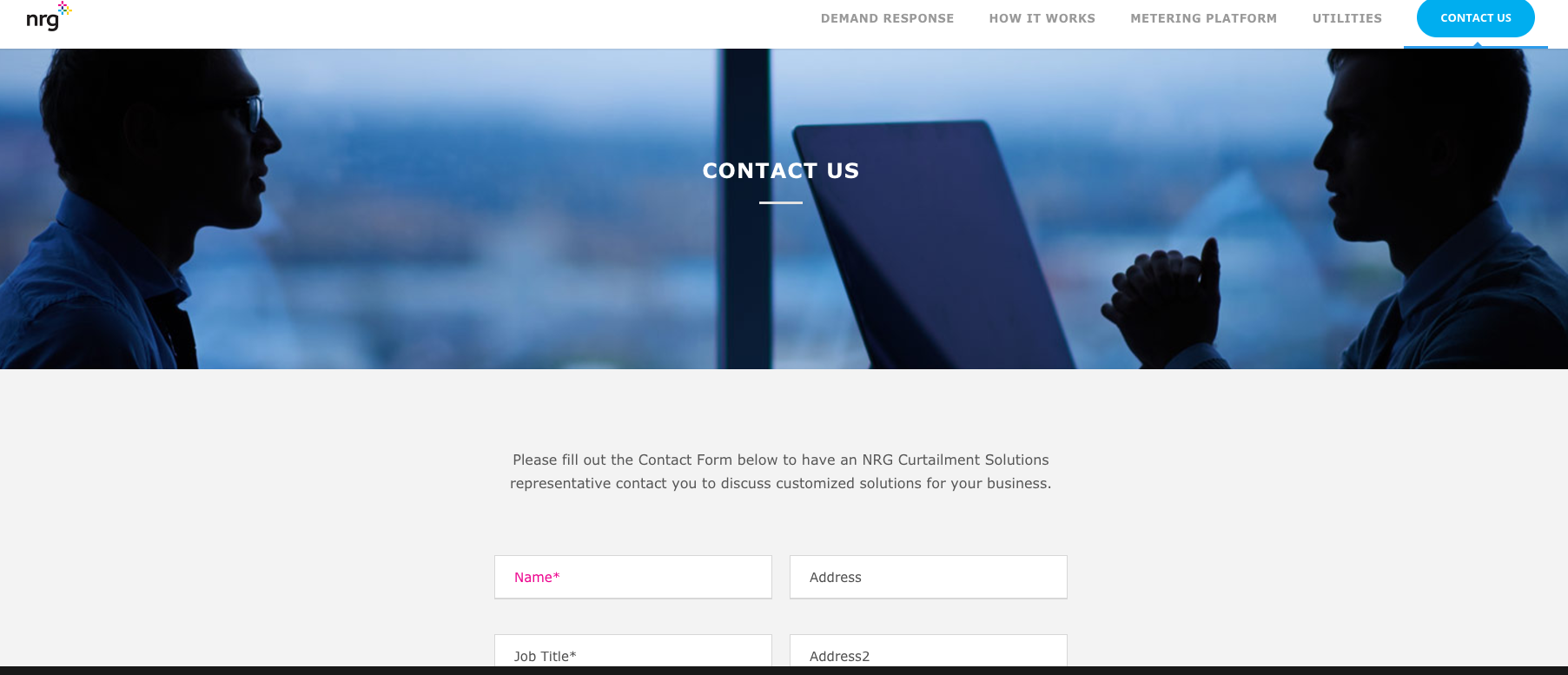
Contact Us Form
Key Features:
- Responsive design with elegant handling between mobile device (single column form fields), and desktop/tablets (two column form fields).
- Striking and compelling image.
- Directional copy to encourage visitors to fill out the form.
- Clearly marked required fields.
- Error handling with human language.
- Clear and boldly colored submit button.
Weeks start to finish.
Team members–Julie crafted the information architecture, mini “wireframes” and key content hierarchy. Hunter Eckland designed the website.